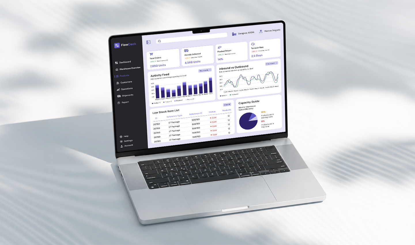
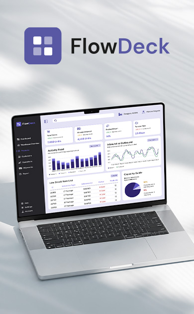
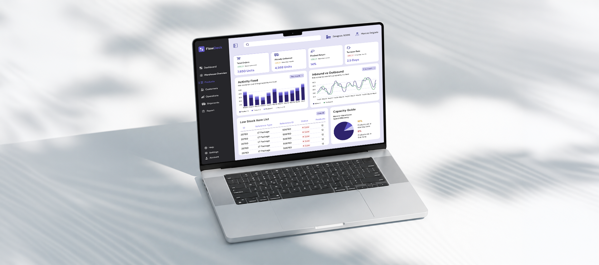
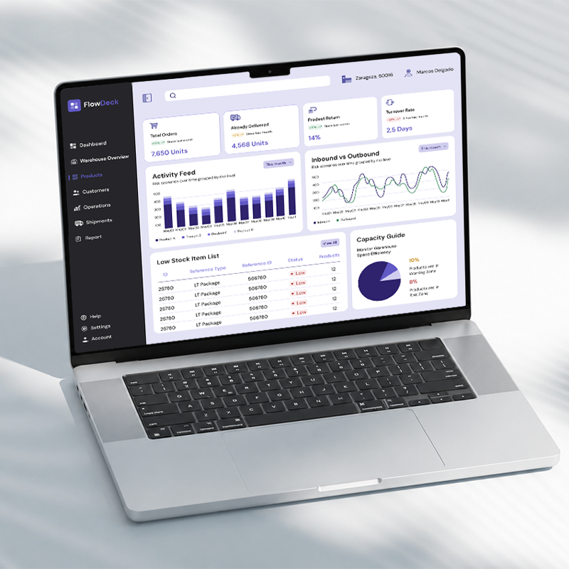
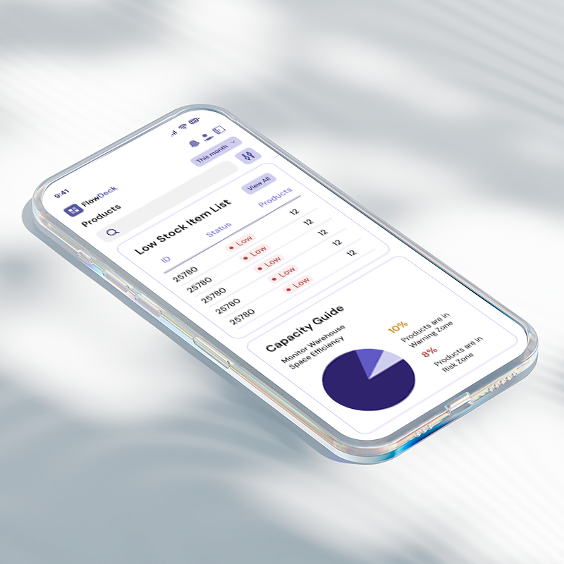
FlowDeck is a Warehouse Management System (WMS) designed for an industrial company with multiple warehouses and manufacturing facilities distributed across the Iberian Peninsula. The platform unifies inventory management, orders, shipments and RFID integration in a single environment, adapted for both mobile and desktop.
Due to a non-disclosure agreement (NDA), all identifying information has been anonymised. The process, design decisions and layouts shown are real, data and branding have been altered to comply with confidentiality requirements.
-87%
99,5%
+28%
-64%
-72%
Inventory Time
Inventory Accuracy
Operational Productivity
Operational Errors
Item Location
-87%
Tiempo de inventario
99,5%
Exactitud de inventario
+28%
Productividad operativa
-64%
Errores operativos
-72%
Trazabilidad
My Role
From the beginning of the project I took part as the lead product designer, developing the experience from scratch over a period of more than six months. My work began in interview sessions with warehouse staff and operations managers, sessions that gave us the raw material to understand where friction lived and what users genuinely needed.
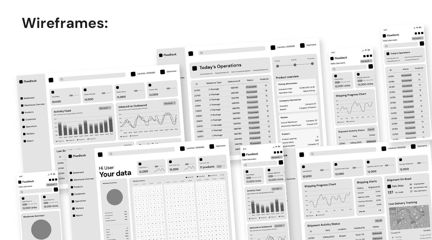
That research fed directly into detailed user flows, wireframes and iterative prototypes, tested and refined across multiple rounds with internal users and external industry professionals. Throughout the project I also acted as the connection point between the software development team, the RFID engineering team, and the warehouse operations department, translating between technical constraints and user needs at every stage.
Problems & Objectives
The client had already worked with us on different occasions, having previously been supplied with hardware equipment and support at several of their facilities. They came this time with a broader problem: the need for software that would unify all their processes, as they were working with different tools for each process. Through user interviews and on-site sessions, we identified four core problems:
Fragmented systems, fragmented work. Staff were managing up to four different applications to handle what should have been a single workflow, stock, orders, operations and shipments each living in a different tool.
Lack of real-time stock visibility. Workers needed an immediate, simplified view of stock status that would allow them to make faster decisions without leaving their current task.
Lack of data for decision-making. Operations managers had no real-time analytics layer. Reports were manual, delayed and disconnected from the real state of the warehouse.
Non-existent shipment tracking. There was no way to monitor outgoing orders in real time, creating uncertainty both internally and with clients.
From research to decision
The most revealing finding from our user sessions wasn't about the interface, it was about the physical reality of working in a warehouse without the right tools. Warehouse operatives were verbally coordinating with each other across the floor to know which shelves were full or empty. Inventory was tracked manually, which meant stopping work to log every movement. The operations manager was juggling multiple applications daily while the operatives were working largely from memory and verbal communication, an entirely analogue system inside a technically complex operation.This single insight drove two of the most important decisions in the project.
Decision 01:
Integrate RFID from the ground up. Rather than designing a better interface for a broken data model, we partnered with the RFID engineering team to automate data capture entirely. Operatives no longer needed to stop and report their movements, the system tracked everything in real time through sensors and tags installed across the warehouse. This eliminated the manual inventory process and removed a critical source of delays and errors.
Decision 02:
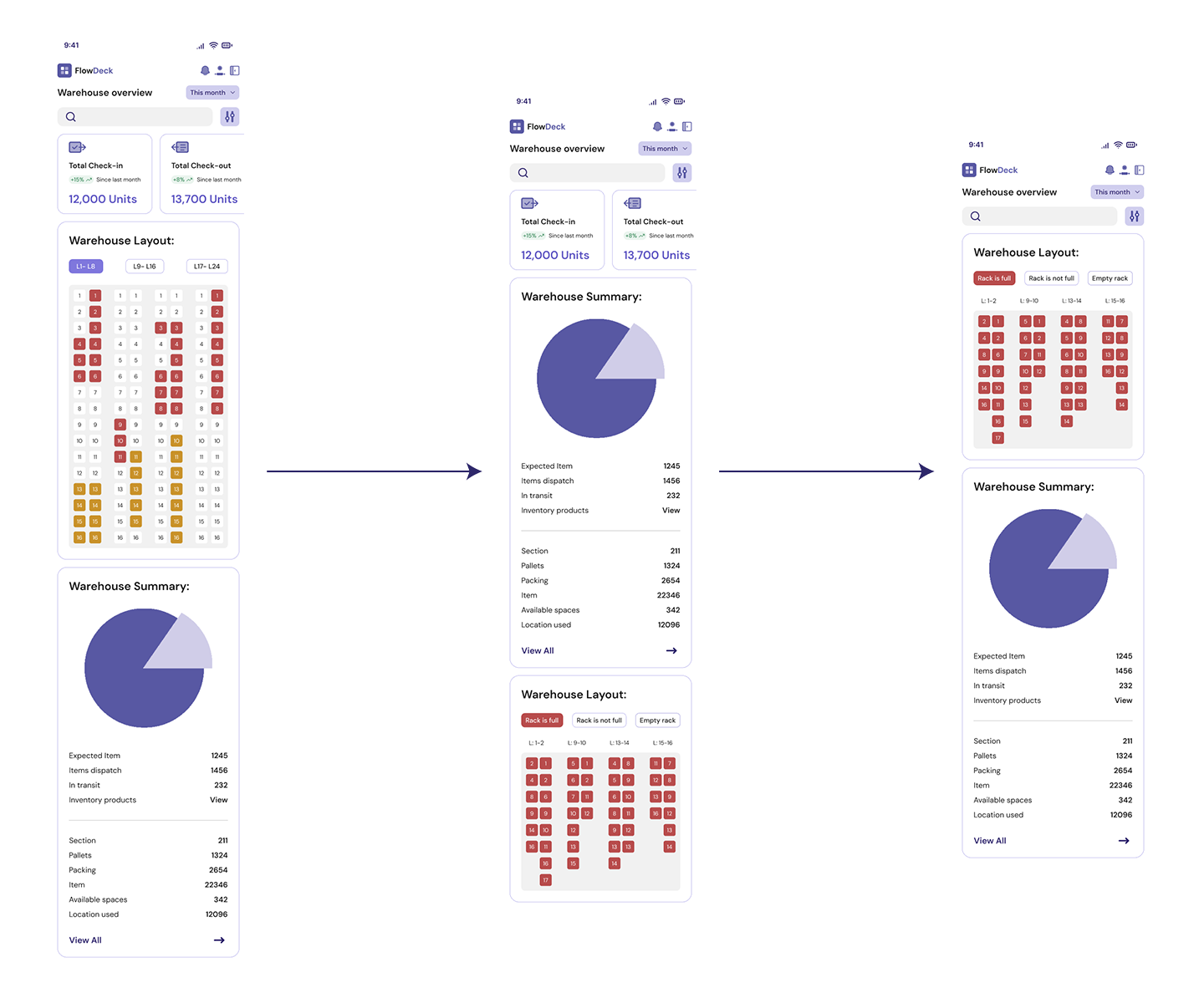
Two distinct experiences for two distinct users. Our initial prototypes gave both the operative and the operations manager the same interface. User testing made it immediately clear this wasn't working. The operative doesn't need growth analytics or historical comparisons, they need to know what to do next, where to go, and what the current stock status is, without scrolling or navigating away from their task. We stripped the mobile version back to only what was essential for their role, creating a focused, task-driven experience that matched how they actually worked on the floor.
User Personas
Carlos Fuentes
Warehouse Operative
Age
Gender
Experience
Device
Tech level
34
Male
8 years
Mobile / PDA
Medium
Bio
"I'd like to have an easy and accessible task list. The less time I have to spend in the programmes, the better."
Frustrations
• Wastes time switching between apps to complete a single task
• Need to check product stock daily
• Hard to see at a glance which operations are pending in his shift
• Entering shipment data manually is slow and error-prone
Goals
• Know immediately which operations he needs to complete today
• Detect low-stock items without having to generate a report
• Log shipment data quickly from the warehouse floor
• Spend less time in the app and more time on the actual work
Nadia Belmonte
Operations Manager
Age
Gender
Experience
Device
Tech level
41
Female
12 years
PC / Laptop
High
Bio
"I need to see everything at a glance. If I have to click many times to find things, something is wrong."
Frustrations
• No single view that gives her the full picture of operations, stock and shipments
• Reports require manual work and are always slightly out of date
• Cannot monitor multiple warehouses simultaneously without switching between systems
• Justifying operational decisions requires a manual data gathering process
Goals
• Access a real-time view of all processes from a single dashboard
• Identify bottlenecks and inefficiencies before they become problems
• Make data-driven decisions without depending on someone else to prepare the numbers
• Reduce operational overhead by having everything in one place
Constraints
Too much information, not enough clarity.
The hardest design problem in this project wasn't building the features, it was deciding what to show and where. Our first dashboard attempts tried to surface everything at once: metrics, charts, operations, shipments, stock levels, historical data. The result was a visually chaotic screen that was impossible to navigate or scan quickly.
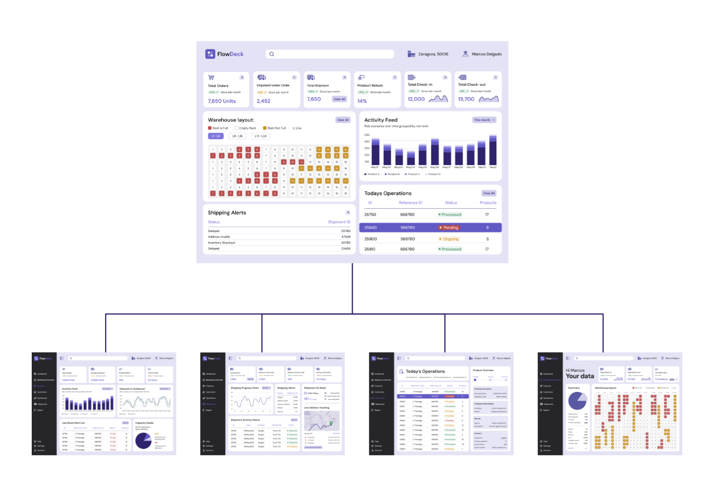
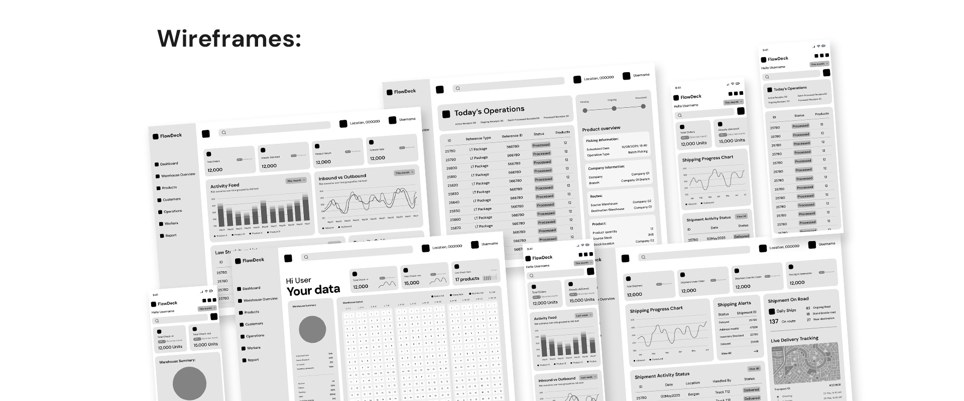
The solution was structural. We moved away from a single dense dashboard and designed seven dedicated sections, each accessible through a lateral navigation menu. Each section followed a consistent grid structure with clearly separated information cards, allowing users to find what they needed at a glance without competing for visual attention with everything else on the screen.
This constraint forced a more disciplined approach to information hierarchy than we would have arrived at otherwise, and it became one of the most valued decisions in user testing.
Prototypes &
iterations
During the process, we developed different conceptual prototypes, varying the structure, organisation and content of these. In our sessions with internal staff and external professionals, we showed them these prototypes. After watching them interact with the initial prototypes and seeing how they broke down their operational flow live, we noted what worked and what didn't.
The direct input from these industry experts helped us ensure that the logic of the platform reflected how a warehouse actually works, and with each new iteration we moved closer to the final design the client received.
The following designs represent the final version of everything shown above. After all the research, interviews and failed prototypes, a dashboard has been created that reflects what the operations managers told us they needed for their day-to-day. An application that brings together the information from all the tasks needed to manage and significantly improve the management of their warehouses.
Reflection
The biggest lesson from this project wasn't technical, it was about assumptions. We assumed that giving both user types the same information would feel fair and complete. What users told us was the opposite: the operative didn't need more data, they needed less. Getting that wrong in the first prototypes and correcting it through testing was the most valuable part of the process.
Simplifying for the operative turned out to be just as complex a design challenge as building the full analytics layer for the operations manager, it just required a different kind of rigour.