A lounge pass for economy travelers, one tap away.
Traveloka is a Southeast Asian travel platform where millions of people book flights, hotels and experiences in a single app.

This project is a
design challenge from uixperiment, a platform that publishes product briefs inspired by real apps. The challenge: design the entry point, selection and pricing of an airport lounge add-on for economy passengers, inside the existing flight booking flow, so it raises revenue without slowing down or blocking the purchase.
*Independent design exercise. I have no affiliation with Traveloka, and the business figures come from the challenge brief.
Tools
Figma, PS,AE
Duration
4 days
The problem
A growing opportunity at the wrong moment
The brief points to a real signal: ancillary revenue growth has slowed by 12%, and 15% of economy passengers tried to buy lounge access on their own after booking. The demand exists, but it leaves the app, and the revenue leaves with it.
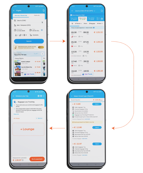
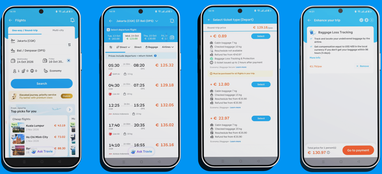
*Current flow, mapped from the app
Traveloka’s flight checkout is built for speed. Its add-ons, such as baggage and seat selection, are simple, familiar choices that most travelers resolve at a glance. A lounge is different: it asks for a real decision. Travelers need its essentials to judge whether it’s worth it, and whether the price beats paying at the door.
‍
The checkout also has strict limits. It must stay at four steps, the add-on can never be mandatory or force a “decline”, and it has to work for one traveler or several. On top of that, lounge availability has to be checked and takes about two seconds to load, which the interface has to absorb without blocking the purchase.
‍
So the challenge is a balance: visible enough to convert, light enough not to cause decision fatigue or abandonment.
Solution & Impact
Same four steps. One more reason to say yes.
Enhancing the trip experience without compromising checkout time. Still four steps, and nothing can block the payment.
The lounge fits where travelers already choose extras

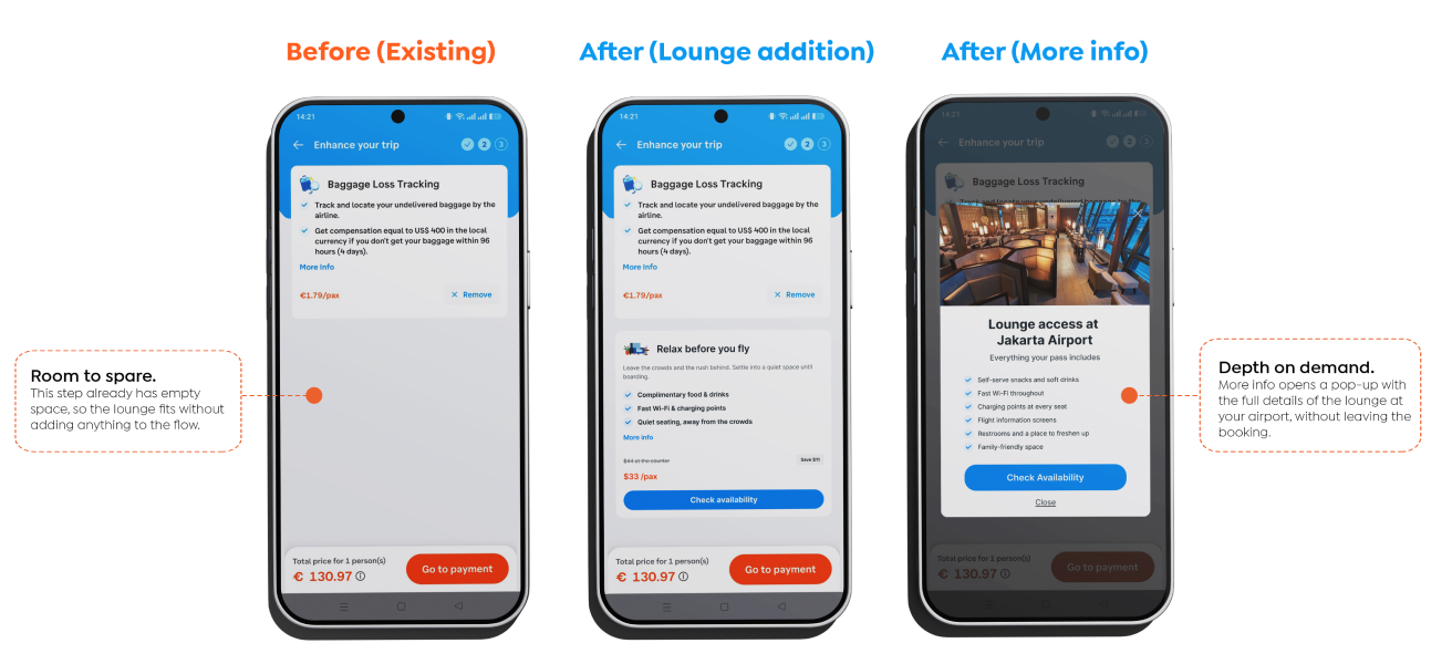
Instead of adding a new step, the lounge becomes a second option in the Enhance your trip section, which today offers a single service. The booking stays at four steps, and nothing about it is mandatory: travelers can ignore the card and continue to payment without any extra action. Whether the booking has one passenger or several, the total updates as they choose. The entry point only appears on airports with a lounge partner (assumed list).
Premium feel, economy price

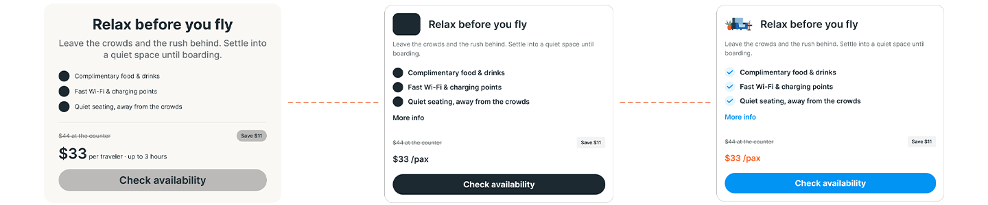
The lounge card gives travelers what they need at a glance: the main services included, the app price shown next to the walk-in price at the counter, with the saving presented as a clear advantage, and a line about the calm of the lounge compared with the bustle of the terminal. Since we assume the same database that lists lounge airports also holds up-to-date rates, the price is visible from the start, before any tap. The saving is the strongest argument for buying in the app, so it shouldn’t wait behind a button (prices assumed).
The main action isn’t “Select lounge” but Check availability, for two reasons:
- It sets expectations. Travelers know from the first glance that there is a short check before anything happens, so the wait never comes as a surprise.

- It keeps the lounge feeling premium. Even as an economy add-on, it becomes something you get into rather than a box you tick, which adds a touch of exclusivity on top of the discount.
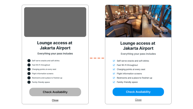
For travelers who want the full picture, More info opens a pop-up with every detail of the lounge, so they can explore without leaving the booking or slowing down everyone else.
There are three outcomes
- Available: the lounge is added to the booking automatically, with no second tap. The total updates with the final price, and the button gives way to a short Lounge added message, with a gradient transition that shows it has turned from an action into a status. Next to it appears a Remove action, so the traveler can undo it in one tap if they change their mind.
‍
- Unavailable: the card stays in place, greyed out with reduced opacity, and a short message explains why. Instead of disappearing, which could look like a bug, the section clearly shows there is no access, and the layout doesn’t shift.

- Error: if the check fails, a short message (“Sorry, something went wrong. Try again”) appears with a retry action, and the rest of the checkout is unaffected.
Solution & Impact
Estimated Impact
Every figure below is an estimate built from the brief’s targets and explicit assumptions, not real Traveloka data.
5%
Lounge attachment rate
Of eligible international economy bookings add a lounge in the first quarter. It turns the 15% who were already looking for lounge access elsewhere into sales inside the app.
+8%
Transaction value on lounge bookings
The pass adds a high-margin extra to the booking, and the visible saving against the counter price gives a reason to buy it here.
7.5%
Tap rate on Check availability
Of eligible bookings tap the new entry point. One tap checks and adds, so interest turns into a sale without a second step.
≤ +2 s
Average checkout time
Same four steps, and the two-second check never blocks the screen. Only the travelers who tap spend a few extra seconds.
Design Process
How to sell without slowing down
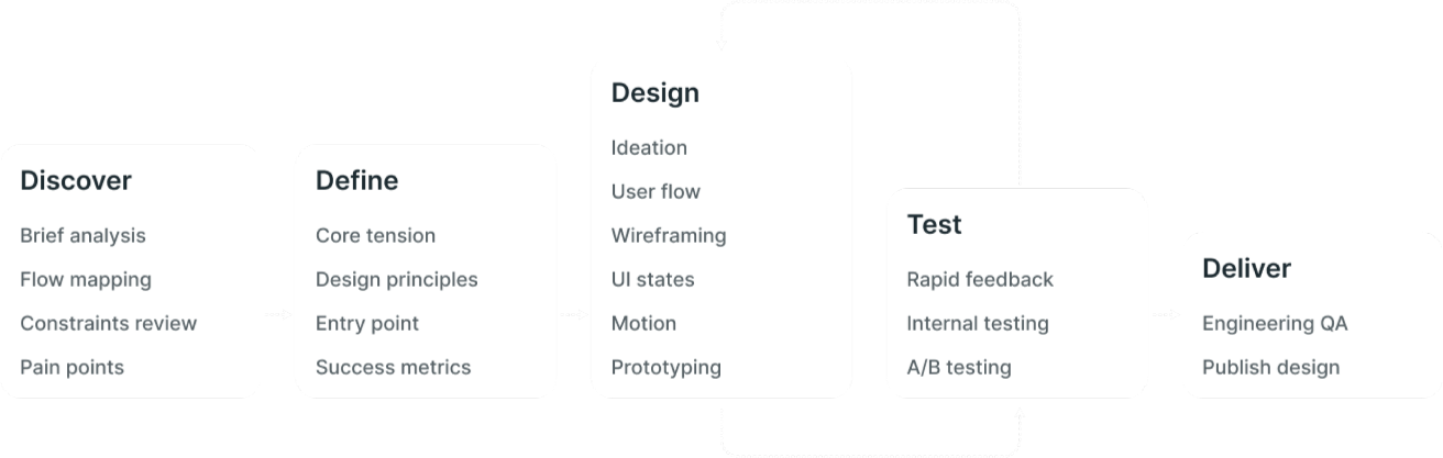
Adding a new offer to a checkout without adding a step, or a second of friction, is harder than it sounds. This process was built around that constraint: mapping the real booking flow to find where the lounge could live, then shaping every decision around conversion, scalability and the traveler’s experience, so the section sells without slowing the purchase.
User Flow
Where the lounge fits in the booking flow
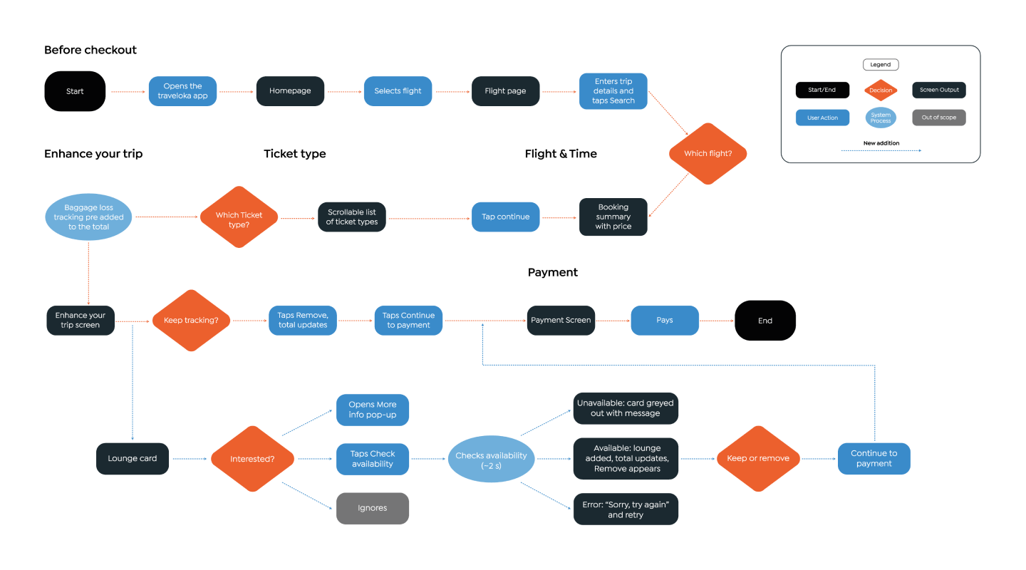
Through my own walkthrough of the app, I mapped the complete user flow, with every point where the traveler makes a decision and every detour they can take. The map starts when the user opens the Traveloka app and follows the path through to the flight booking.


Inside the flight flow, the diagram lays out the four steps: flight and time, ticket type, Enhance your trip and payment, with the choices and branches each one involves. In the corner, the step we want to change is shown in detail: Enhance your trip with the lounge integrated. The flow doesn’t gain a single step. A traveler who ignores the lounge goes straight on to payment as before, and only the one who chooses it spends two extra seconds on the availability check.
Design Decisions
Decisions that protect the checkout
Every decision below answers the same question: how do we make the lounge visible without slowing down the purchase?
1. Placement: inside Enhance your trip

The lounge becomes a second option in the one step designed for optional extras, which today offers a single service. It adds no step and doesn’t touch the fare comparison.
Discarded: adding it to the ticket types. That’s the densest step, it would make the lounge feel like part of the fare rather than a choice, and it would mean reworking fare packages, outside the scope. A homepage banner and a notification for returning travelers stay as a next step.
2. One tap to add, one tap to undo

Check availability checks and adds the lounge in a single tap. If the check is affirmative it updates, the button becomes a Lounge added status, and a Remove action appears. Unlike the baggage tracker, which comes pre-added, the lounge is never pre-ticked: it’s added only when the traveler asks for it.
Discarded: a direct Add button, and a two-step “check, then confirm”. The first hides the wait, and the second costs an extra tap. Remove reuses a pattern already on this screen, and nothing needs to be pressed to continue to payment.
3. A card that sells at a glance, with depth on demand

The card shows three key services, the app price next to the counter price with the saving, and a line about the calm of the lounge. Everything else lives in the More info pop-up, so interested travelers get the full picture without leaving the booking. The price is visible from the start, since the saving is the strongest reason to buy here.
Discarded: a full detail page, which would take the traveler out of the flow.
4. Every state is visible: nothing disappears

Checking, added, unavailable and error each have their own state. The loading animation uses the app’s illustration style, ends as soon as the data arrives, and never blocks the screen. If there’s no lounge, the card stays greyed out with a short message. If the check fails, a retry appears.
Discarded: hiding the card when unavailable. An abrupt disappearance can look like a bug, and the layout would jump.
5. Exclusivity, not scarcity

Check availability gives the lounge a touch of “getting in”, on top of the discount. But we left out counters like “only 2 left” and any countdown. Every traveler who wants the service deserves the same treatment, and urgency made up for the sale would trade trust for conversion.
Designed mobile-first, since the app is where the booking happens. Desktop would reuse the same logic and states with a wider layout.